Jubilee
A Multimodal Event Planning Tool
UX Research | UX Design | UI Design | Prototyping
Six Weeks | Three Phases
designed using:


Overview
Jubilee is a multimodal event planning solution built for planners of high-end events. Through customizable modules and integration with preexisting organization and data management tools, it facilitates the tracking and transfer of vital data to ensure high-end events are executed flawlessly and customers are left satisfied.


Key Features

Full Service Planning Capabilities

G-Suite Integration

Client Management Tools

Seamless Client Contact

Event Execution Support
The Problem

High-end event planners need to organize and communicate event information effectively in order to ensure events leave customers satisfied.
The Discovery

Research Goals
Determine users’ organization and planning habits
Identify the elements of the event planning process
Identify struggles that arise throughout the event planning process.
Understand how clients interact with the planning process
Determine elements that affect the planning process
Define the metrics used to determine the success of an event

Emily
Age 32
Event planner at high-end event company
Frequently on site for event execution
Focuses primarily on weddings, mitzvahs, and corporate events
Struggles with clients meeting deadlines, particularly when involving payments

Sarah
Age 36
VP at large-scale catering and events company
Uses Apple and Google organization tools
Frustrated by lack of integration between software in workflow.
Dissatisfied with current planning tools

Jess
Age 31
Event planning assistant
Primarily plans weddings
Uses Apple and Google products for organization. (dislikes paper)
Relies on manual reminders to track deadlines
Wishes there was more automation in her workflow

Alyssa
Age 34
Event planning consultant
Previously worked in restaurants and catering
Works primarily on weddings
Uses Google products for organization.
Liked using paper, but felt guilty about the environmental waste
*Personas based on characteristics of research participant who wish to remain anonymous.
Data Synthesis
Interview participants provided insight into the event planning process. In a broad sense, these processes were mostly the same, but the minute tasks and order of execution varied from planner’s personal workflows and preferences to event type. This chart serves to illustrate their emotional journey throughout their process.

*Chart represents a potential workflow of planners. Order and list items may change from planner to planner.
Insights
The following insights stood out based on their categorization as points of stress and friction, or vital points in the process that required fortification.

Client-Planner Interactions
Clients are reluctant to part with money.
Multiple parties speaking on behalf of the client with different ideas (Parents involved in client’s planning process)
Difficulty resolving action items in a timely manner due to points of friction in the communication process
Manually following up takes up the most time in the planning process

Data Organization and Integration
Files being used by multiple people
Difficult to find critical files, particularly without naming structures
Current tools don’t integrate with common organization software such as Google Calendar
Too much time spent on manual tasks

Communication of Critical information
Event success depends on communication of information (timeline, layouts, guest needs, etc…)
Event data currently organized in difficult-to-manage physical binders
Planners dissatisfied with paper consumption
The planning of high-end events is a complex and often cyclical process, requiring frequent reference, communication, and alteration of data that is crucial to the successful execution of an event. Event planners identify manuall communications as being time consuming, and wish for integration of their tools to help streamline their workflows and ensure accuracy.
“The more things can talk to each other and answer questions without me being involved, the better. It's like having a strong team.”
The Process
Competitive Analysis
Upon completion of data synthesis, a competitive analysis was conducted to identify the strengths and weaknesses of competitors, as well as opportunities for improvement and innovation.
Strengths
Comprehensive list of features
Customizable based on business type and needs
Analytics reporting
Onboard document signing
Weaknesses
Very poor UI
Overly-broad customization makes setup and using too complicated
Features do not function as intended.
Lack of integration with established software
Online reviews show dissatisfaction with current products
Opportunities
Ensure integration with current data management and organization software (Google)
Automate client followups regarding action items
Keep customization limited
Design more user-friendly interface
Design for the multiple “phases” of an event
Threats
Significant established competition
Existing products make it difficult to migrate important information to new platforms
Fast paced nature of industry makes it difficult to implement new tools
Feature Concepts and Prioritization
Upon completion of the the competitive analysis, the following list of potential features was generated:
Must Have
Integration with Google
Timeline generation
Automated followup reminders
Master event calendar
Captain’s view (tablet) generator
Events overview dashboard
Task tracking with reminders
Should Have
Offline document downloading
Vendor and client lists
Client Accounts
Budget bank displaying progressive spending
Proposal generation
Could Have
Vision board
Customizable document templates
Menu management (catering)
Guest Lists and digital RSVP
Won’t Have
Floor-plan and layouts
Lead generation function
Initial Sketches
Using the feature list as a guide, rough sketches were produced to ideate on potential features and task-flows.


User Testing - Low-Mid Fidelity Task-flows
Users were asked to complete multiple flows for each of the platforms designed for (examples of which can be seen below). Concurrent probing was utilized to gain insight into users’ thoughts and identify opportunities for improvement.


Desktop Low-Mid Fidelity User Testing Conclusions
Users accomplished the presented workflow with minimal friction, but identified a few points to refine.
Users expressed confusion regarding where to add the band, citing “event component” as not being a strong identifying title.
Users expressed concern when reviewing Josh and Lauren’s event tasks. They felt the “waiting on them” label was confusing.
Users expressed concern regarding the lack of manual input fields when proposing a new vendor to the clients.

Mobile Low-Mid Fidelity User Testing Conclusions
Users accomplished the presented workflow without friction, but identified a few points to refine.
Give clients the option to delay decisions for later - then remind them
Clarify navigation in future designs


Tablet Low-Mid Fidelity User Testing Conclusions
Users accomplished the presented workflow without friction, but identified a few points to refine.
Users felt the side navigation bar was not intuitive and did not mach expected navigation patterns.
Users believed the clock on the navigation panel was superfluous, as the time is already present on the status bar.
Users questioned the necessity of the timeline bar, but liked it after having its function elaborated on.
Users felt the dark mode concept (activated via the moon icon) was not a worthwhile addition, as in the chaotic reality of onsite execution, nobody would legitimately take the time to manually switch between light and dark modes.
The Design
Color Palette
The color palette was selected to give the applications a “high end” esthetic. Multiple fashion brands were researched for inspiration, resulting in black and white being utilized as the primary colors. The pink/magenta and blue accent colors evoke thoughts of fashion and beauty, while maintaining a neutral aesthetic and preventing the alienation of potential users.

Typeface & Font
Kudryashev Display was selected as a title font to give the products a high end feel. Using Tiffany & Co.’s logo, as a model, the font was selected for its serif features and delicate weight. Open Sans was utilized for more specific headings and body content. As the tool is intended for the recording and communication of vital information, it was important to choose a clean, easy-to-read font that maintained a sophisticated aesthetic.

Imagery & Tone
The overall tone is business focused. Imagery is kept to a minimum. As the mobile client is a customer facing application, there is a heavier emphasis on photographic material. The desktop and tablet tools primarily feature avatars and iconography. Language is simple and direct throughout the product suite in order to ensure clarity of communication.

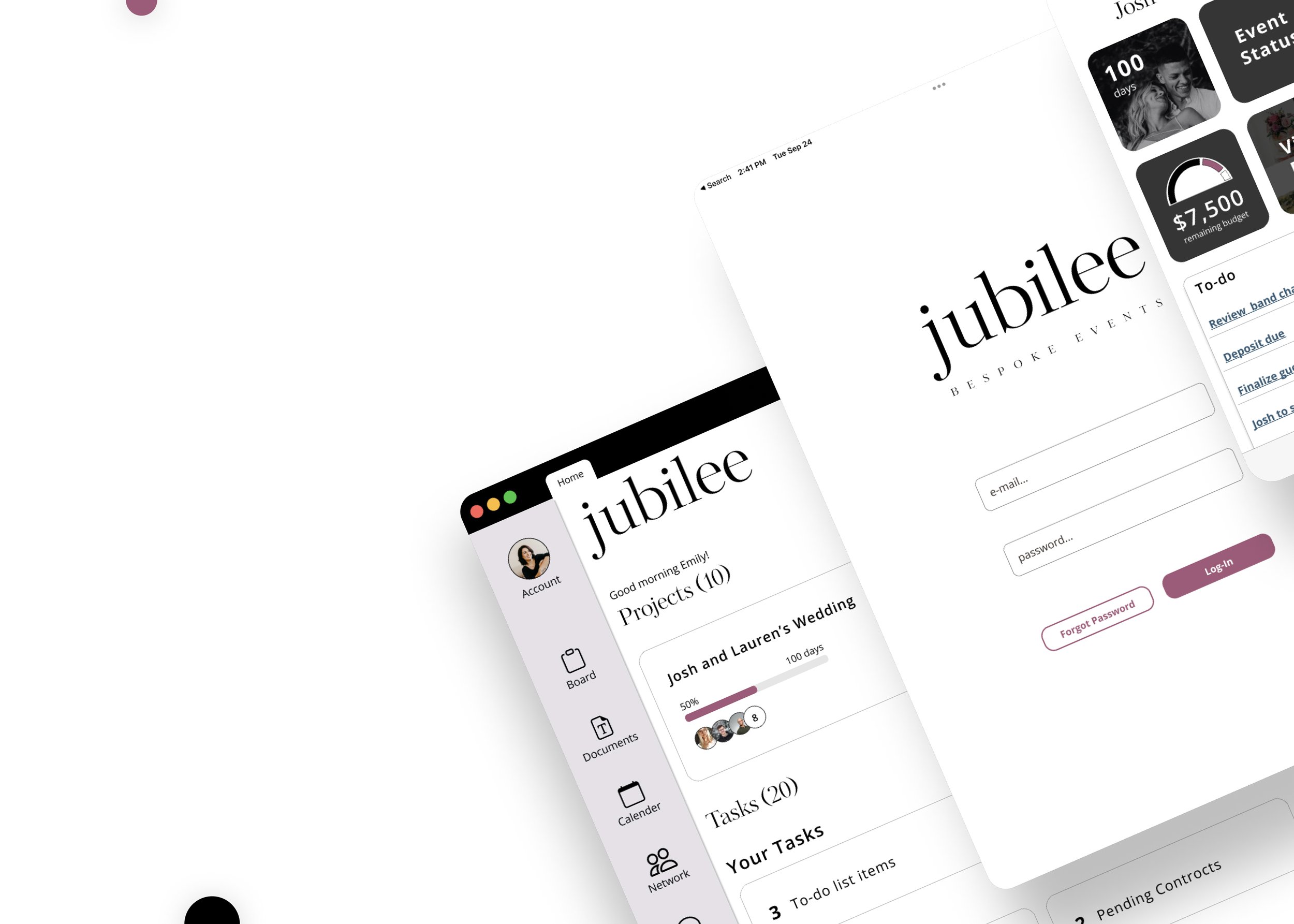
The Solution

Jubilee is a multimodal event planning solution built for planners of high-end events. Through customizable modules and integration with preexisting organization and data management tools, it facilitates the tracking and transfer of vital data to ensure high-end events are executed flawlessly and customers are left satisfied.

High Level Control Center
All upcoming events and action items are displayed in a broad format giving users an overview of their work and ensuring easy prioritization.
Tab structure facilitates quick navigation between in-progress tasks, helping users as they manage action items relating to simultaneously active projects.

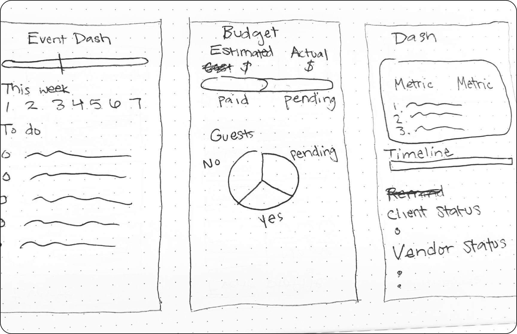
Event Dashboards
Event pages contain modules for planning elements, vendors, planning progress, and upcoming tasks.
Page modules can be customized to fit the planner’s and the event’s needs.
All documents relating to events are stored in Google Drive and easily accessed through the application.
Automated task reminder scheduling decreases time spent on manual followups.

Captain View
Tablet tool (captain’s view) is set up via the desktop application to consolidate and organize information crucial to the on-site execution of an event.
The addition of staff members and items to the to-do list can only be altered via the desktop application, whereas notes and timeline items can be altered on-site by the captain.
Locking-in of information serves to provide the on-site captain an on-the-rails experience.

Calendar Integration
Master calendar can be synced with calendar of choice, enabling users to easily manage all tasks within the Jubilee ecosystem as well as all business tasks outside of it.

Mobile Planning Web Client
Mobile client facilitates communication between planners and clients.
Reminders and quick approval decrease time spent manually following up on action items.
Event status allows the user to keep track of the planning process in real time.
Budget tracking gives the user a detailed breakdown of how their budget is being applied and gives insights into what the true total cost will be.

On-site Captain’s Tool
Event management dashboard replaces the traditional captain’s binder.
To-do list and timeline help captain manage the event flow, while the notes section enables them to easily notate vital information to be referenced in the post-event report.
Captain can access all vital documents in the Google drive pertaining to the event in order to ensure everything is executed as planned.
Staffing check-in allows the captain to simultaneously take attendance and assign them to tasks. Having a visual breakdown of staffing roles will help the captain locate them throughout the course of the event and give the staff a point of reference for what they are responsible for.
Post-event report allows the captain to file their report on-site during the conclusion/breakdown of the event, rather than waiting until the next business day when they have access to a computer.
Value to Planners
Jubilee provides event planners the tools they need to diminish points of friction in their workflow and facilitate the execution of events through the following means:

Decreasing Time Spent on Tasks
The automation of client followups and the quick approval process of the client web tool cuts down on the time-sucking tasks identified by user interviews.
Centralizing Tools and Data
Centralizing of data in Google Drive, and integrating with planners’ pre-existing organization tools enables them to better manage their workload.
Strengthening Communication
The generation of the captain’s view by the planner ensures an organized, detailed breakdown of vital information to ensure the successful execution of events.
User Testing – High Fidelity Prototype
User Feedback – UX
Users expressed satisfaction with the presented task-flows and operations. They did not cite any points of friction, and were able to complete all scenarios with ease.
User Feedback – UI
Users cited dissatisfaction with the select UI elements and design decisions present in all app platforms. These were addressed in the final design as visible in the examples below.
Original Desktop
The original desktop design was described as looking "different” than the mobile and tablet designs. Although this difference was not perceived as being negative, the design was updated to be more inline with the mobile and tablet applications.


Revised Desktop
The color scheme of the app as a whole was updated, and the replacement of certain elements such as the planning progress indicator were updated to solidify a sense of unity throughout the product suite.
Original Mobile
Users cited difficulty with text visibility due to an overuse of black throughout the design. They felt it “made them look where they weren’t supposed to be looking.” They were compelled to look at the lighter areas of the screen before examining the dark areas.


Revised Mobile
To alleviate this, the balance of the color scheme was shifted, lightening the more important areas of the screen to help the users track better.
Original Tablet
Users expressed negative feelings towards the original navigation bar in the tablet version of the application. It was cited as feeling unintuitive, confusing, and not matching expected navigation patterns established by other applications. In addition, the amount of horizontal real-estate it took up, the overuse of black throughout the design, and too many instances of bolded text were cited as making the application seem “overcrowded” and hard too look at.


Revised Tablet
The hide-able navigation panel was replaced with a smaller, static tab bar at the bottom of the screen, with less important navigation items being moved to different pages. The use of black was reduced to give the application a more open feel.
Looking Ahead

Researching the planning industry shed light on the fact it is even more complicated than anticipated. Everyone’s needs are so different from one-another’s, it is difficult to find solutions that satisfy everyone. As the majority of my research subjects were more geared towards wedding and mitzvah planing, it would be beneficial to extend my reach and conduct user testing with planners who specialize in other sectors of the industry. Between the short project turnaround and the limited user testing, it is very likely there are further opportunities for improvement and innovation.