
Fasenra
Pharmaceutical
Patient Website

Overview
The website for AstraZeneca's injectable asthma treatment, FASENRA, was underperforming. SEO audits identified a large number of drop-offs and poor conversion rates. After being brought onto the project, the UX team identified prominent issues with site structure and content, leading to the client taking our recommendation to update the global layout and content of the site.

The problem
Patients and caretakers of people with asthma need to be able to access resources and information about Fasenra in order to make an informed decision regarding whether the drug would be an appropriate treatment option for their needs.
The role
As the primary designer on the team, I collaborated with our UX partners, copy, and art teams to identify shortcomings in the current site, and design and implement solutions to improve the overall experience.
Design goals

Design for clarity
The current site layout is confusing and defies expected patterns. The design should drive users further into the site.

Update content
Reformat and design additional pages to incorporate new drug messaging.

Increased organization
Reorganize site structure to increase content visibility and readability.
Initial ideation
Prior to jumping into full layout design, we produced an initial look and feel consisting of a redesigned home and internal pages, as well as breakdowns of proposed global style updates to present to the client. This utilized all content from their respective live pages, reorganized and skinned with the purpose of increasing overall readability and usability.
Revised navigation
Page navigation was updated from a pinned vertical stack on the left side of the screen to a horizontal bar across the top. This new layout improved upon the design in the following ways:
Optimizes screen space: Provides a cleaner and more streamlined layout.
Enhances visibility: Improves readability and access to content.
Modernizes interface: Aligns with expected patterns and contemporary UI practices.
Speeds up navigation: Allows for quicker access to different sections.
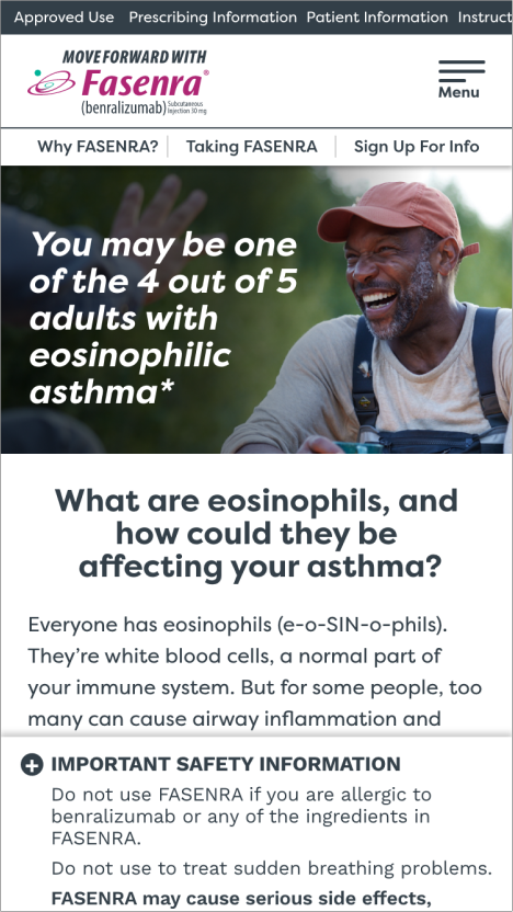
Original navigation

Revised navigation


Revised button system
The button system was simplified and refined to reduce page heaviness and visual clutter, making primary actions more prominent compared to secondary ones. By decreasing the number of button variants, we’ve lessened user frustration and clarified interactivity on the page.
Original

Revised

Revised callout style
Callouts were simplified to enhance hierarchy and readability and to reduce visual clutter on the page.
Original

Revised

First client review


Feedback and takeaways
Reactions to our initial designs were positive, and we were given the go-ahead to carry our design forward to the rest of the site. However, the client requested more comprehensive content changes than initially scoped, requiring the content to be taken back to manuscript, and the project upgraded from a site update to a total redesign. The final design was built from the new manuscript.


Featured improvements
Rethinking the resources
The live site featured instances where content was buried on internal landing pages, such as the resources page. This made it extremely difficult for users to locate the specific resources they were searching for.
Original site

The landing page was eliminated in favor of having all resources accessible via a drop-down nav item in the primary nav bar. This provided a clearer, simpler path for users to follow.
New site

Improving the FAQ’s
Live site instances of on-page FAQs presented users with multiple questions that, when interacted with, linked to the same destination: a large master list of FAQ questions. There were no answers accompanying the on-page instances, meaning there were multiple CTAs in an array leading to the same destination. This list was only accessible via these CTAs. This was resolved by making the on-page FAQs interactive accordions containing the answer to the question being interacted with. A button was placed below to drive users to the master FAQ page. This master FAQ page was also made accessible via the resources drop-down menu on the primary nav bar for ease of access.
Original Site

New Site


Closing thoughts
The redesign was successful in its goal of clarifying task flows and simplifying the overall user experience. Client feedback was overwhelmingly positive, and SEO showed a marked improvement in site performance. At the time of writing, the site is currently undergoing content updates to accommodate a new indication for the drug.